
Oxfam Australia
Project Overview
Client
Oxfam Australia is a prominent nonprofit organization committed to humanitarian and development work. Their multifaceted approach encompasses a wide range of programs and initiatives aimed at addressing the root causes of poverty, inequality, and social injustice. Through advocacy, education, and on-the-ground support, Oxfam Australia strives to build a more equitable and sustainable world for all.
Goal
Oxfam aims to revamp and transform its website with a primary emphasis on meeting the needs of its supporters. The goal is to enhance user satisfaction in order to increase supporter retention and donations.
Key Message
The design will focus on warmth and a sense of human connection. Oxfam would like to express their gratitude for their supporters.
Role
- UX research
- Information architecture
- UX Design
Research
User Interview
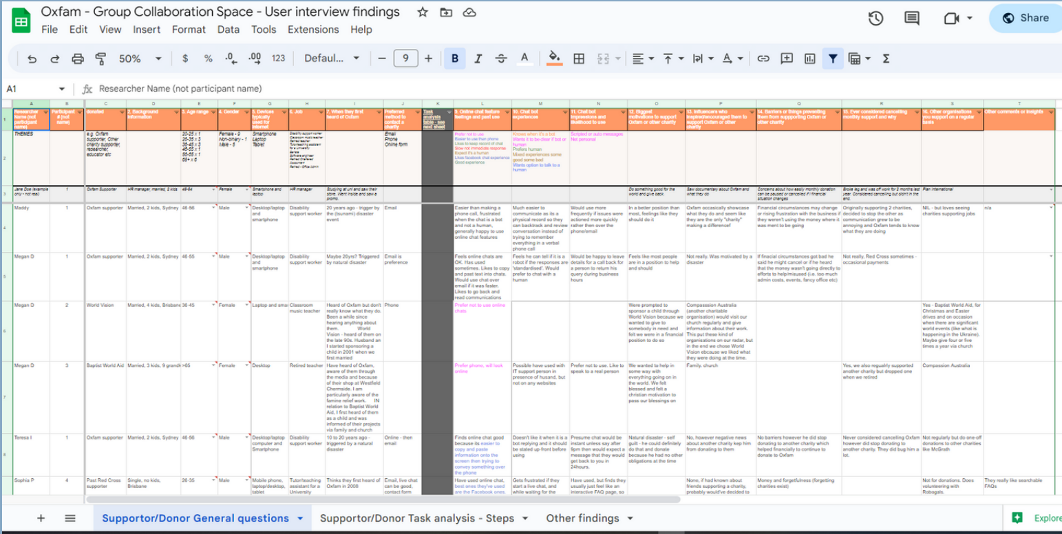
The project team interviewed & conducted task analysis with 24 participants who support and give to charities like Oxfam to understand their motivations, influences, pain points, and feelings.
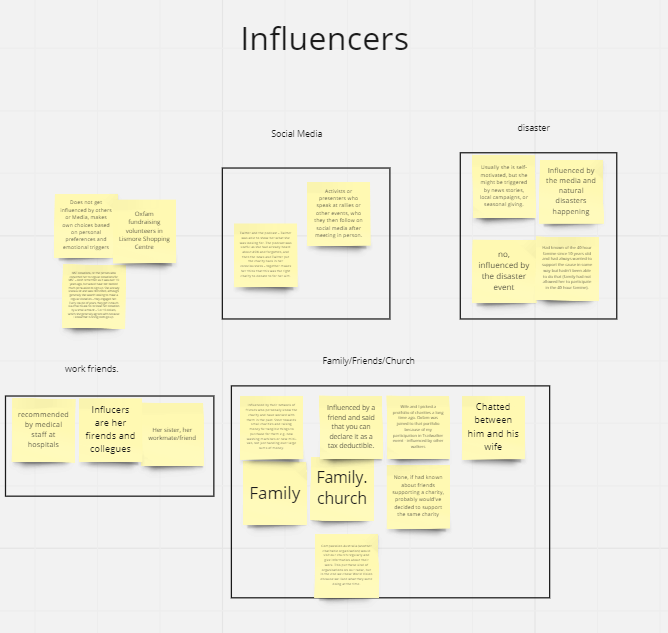
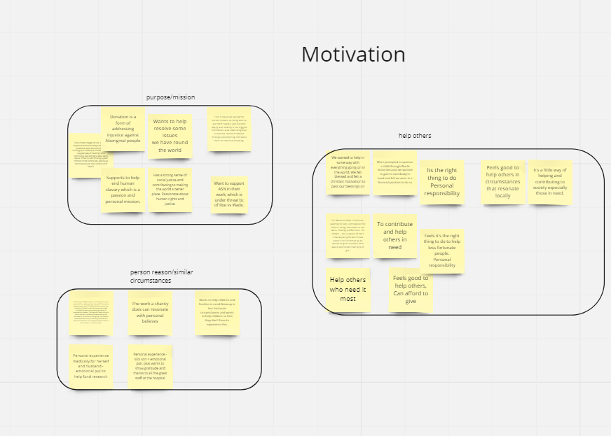
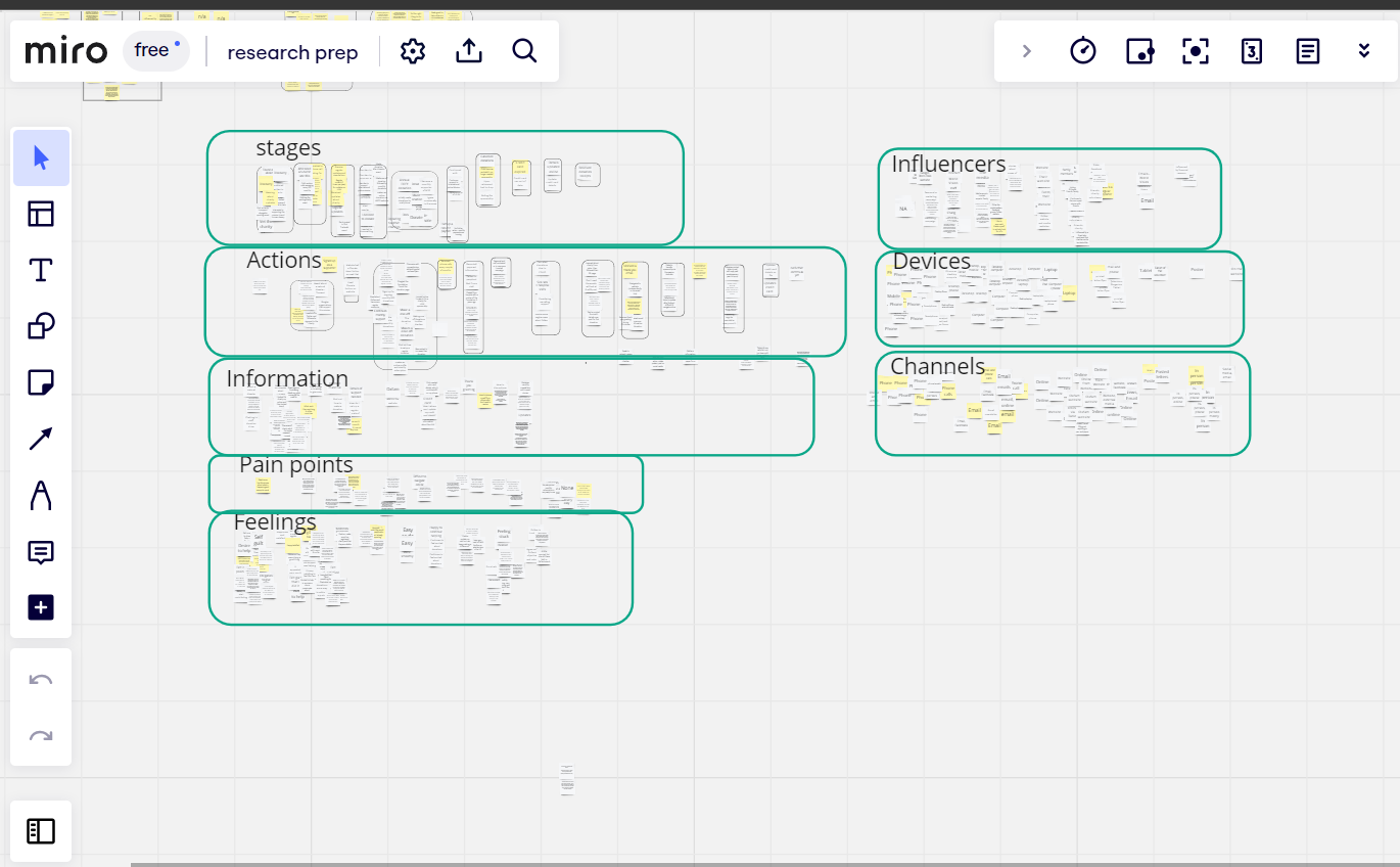
Affinity Diagram
An affinity diagram or affinity map is a tool that allows designers to structure the data from their qualitative research and find underlying themes and trends from their users.
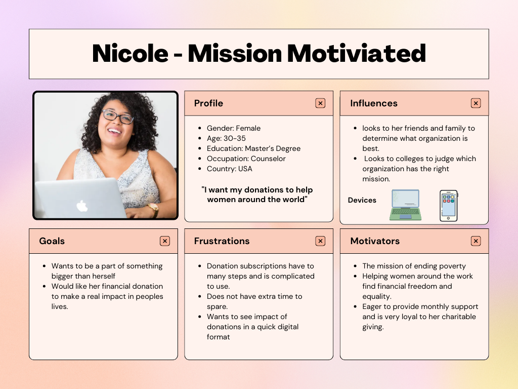
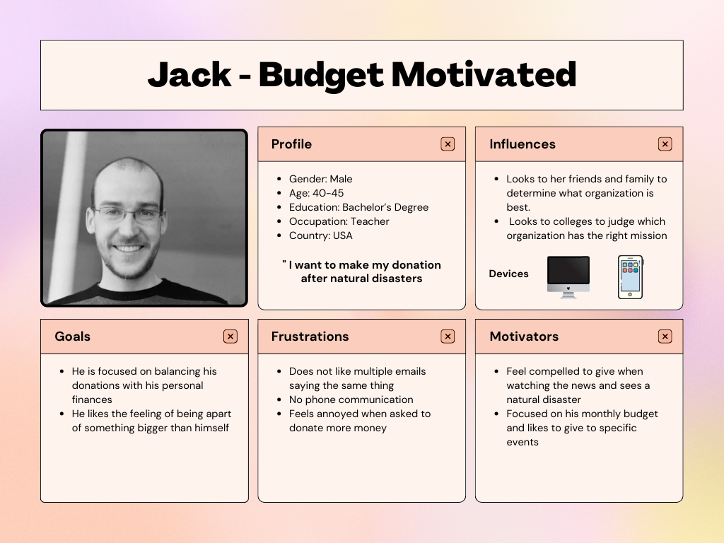
Personas
A persona is a fictional character which represents your target users. Personas are an extremely valuable UX tool, allowing you to better understand your target audience and make design decisions accordingly.
Following an in-depth analysis and empathetic exploration during user interviews, I discerned key themes that emerged as the cornerstones of the personas.
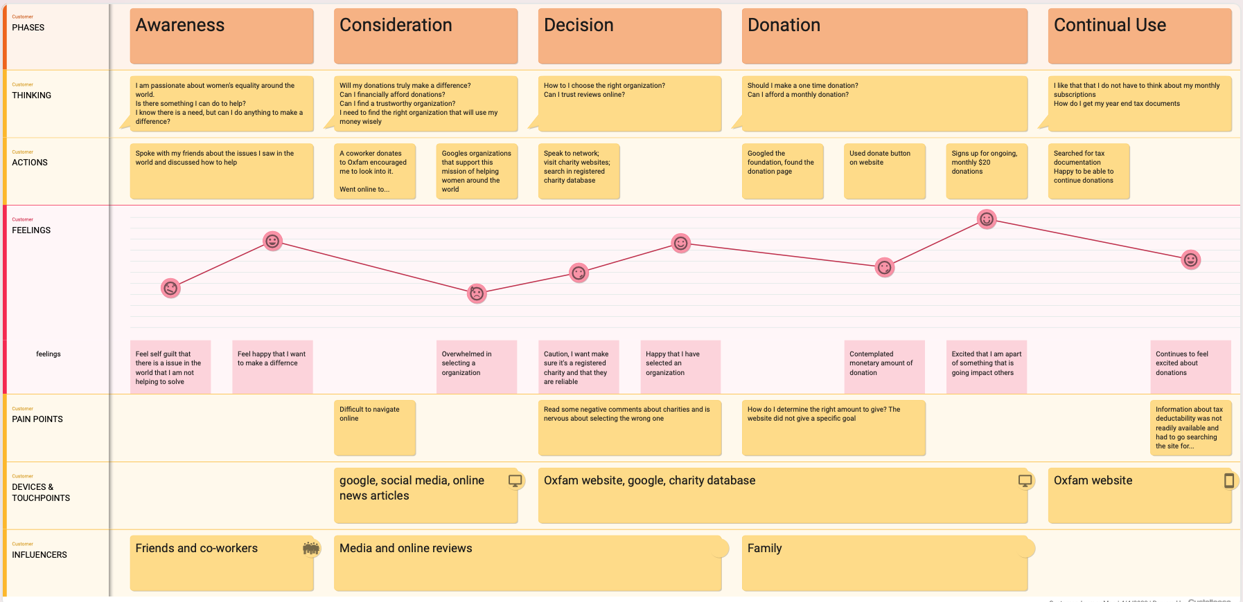
Customer journey mapping
A user journey map is a visual representation of what a user must do to achieve a goal, and outlines the experience they have with the Oxfam brand.
The user interviews were reviewed and carefully broken down to see key themes. These themes become the foundational components of the customer journey maps.
Design
IA
Information architecture is the discipline that ensures users can find the functions, features or content they need to achieve their tasks.
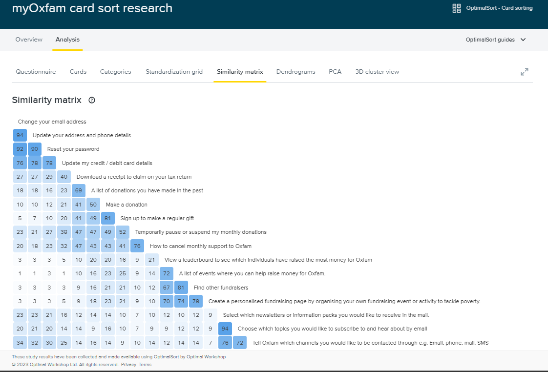
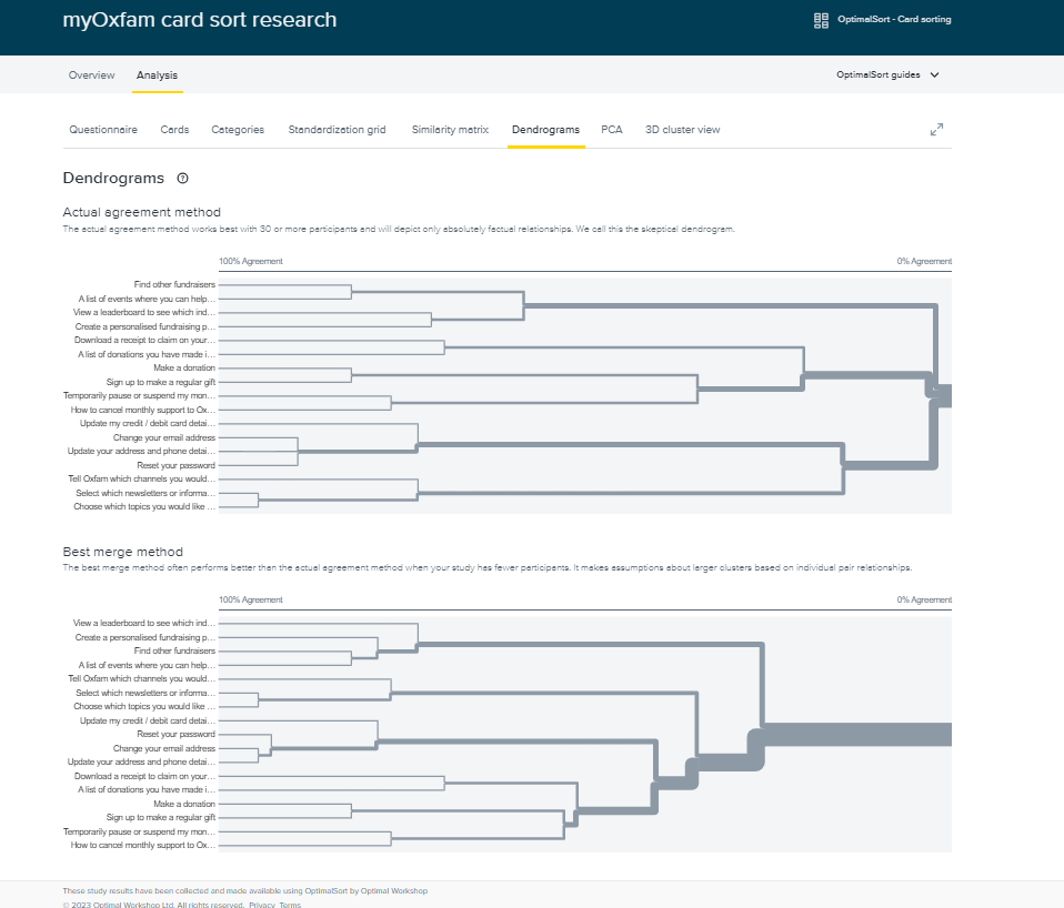
Card sorting
Card sorting is a research method where users organize features, functions and pages of user interface into groups that make sense to participants.
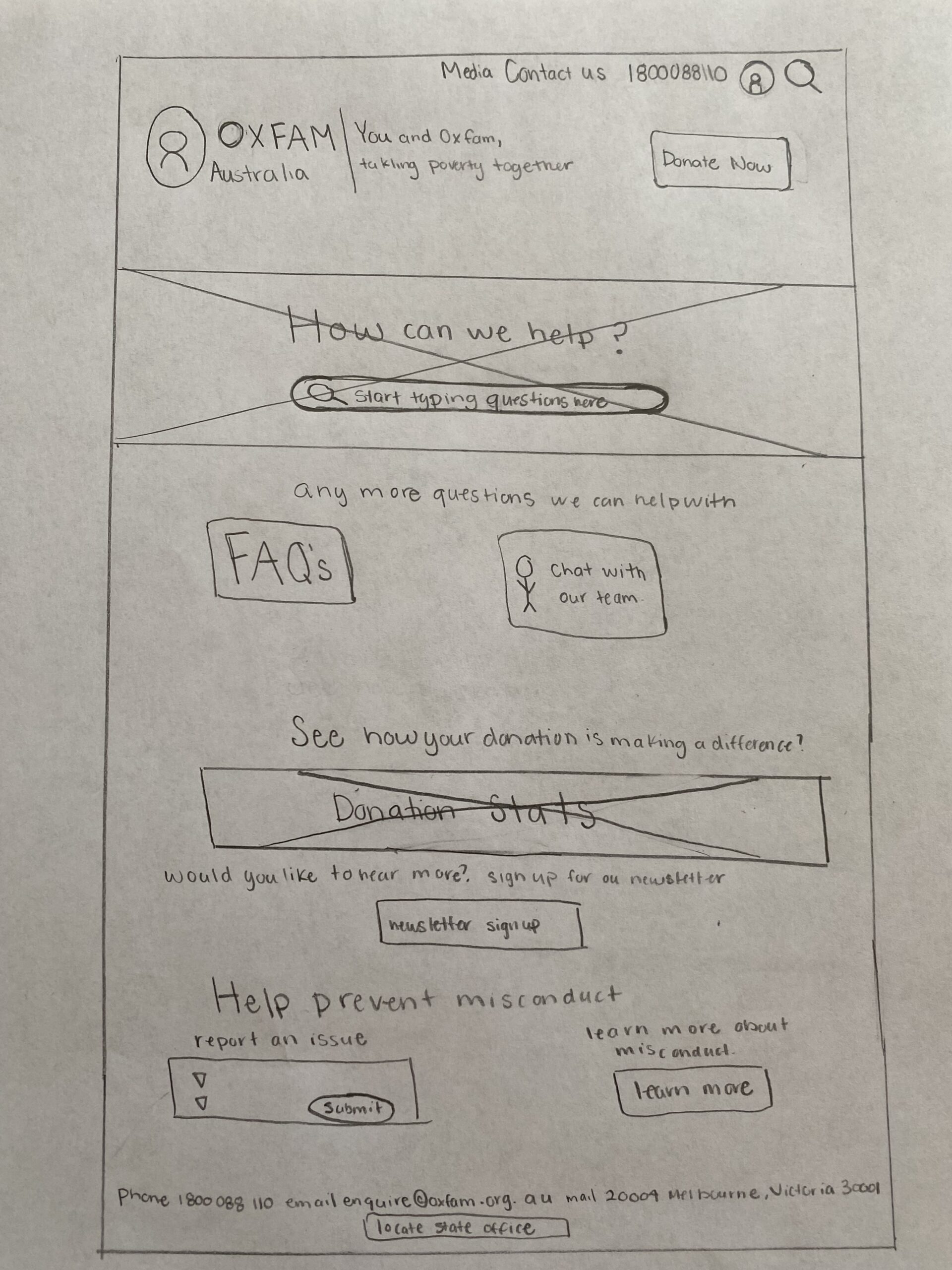
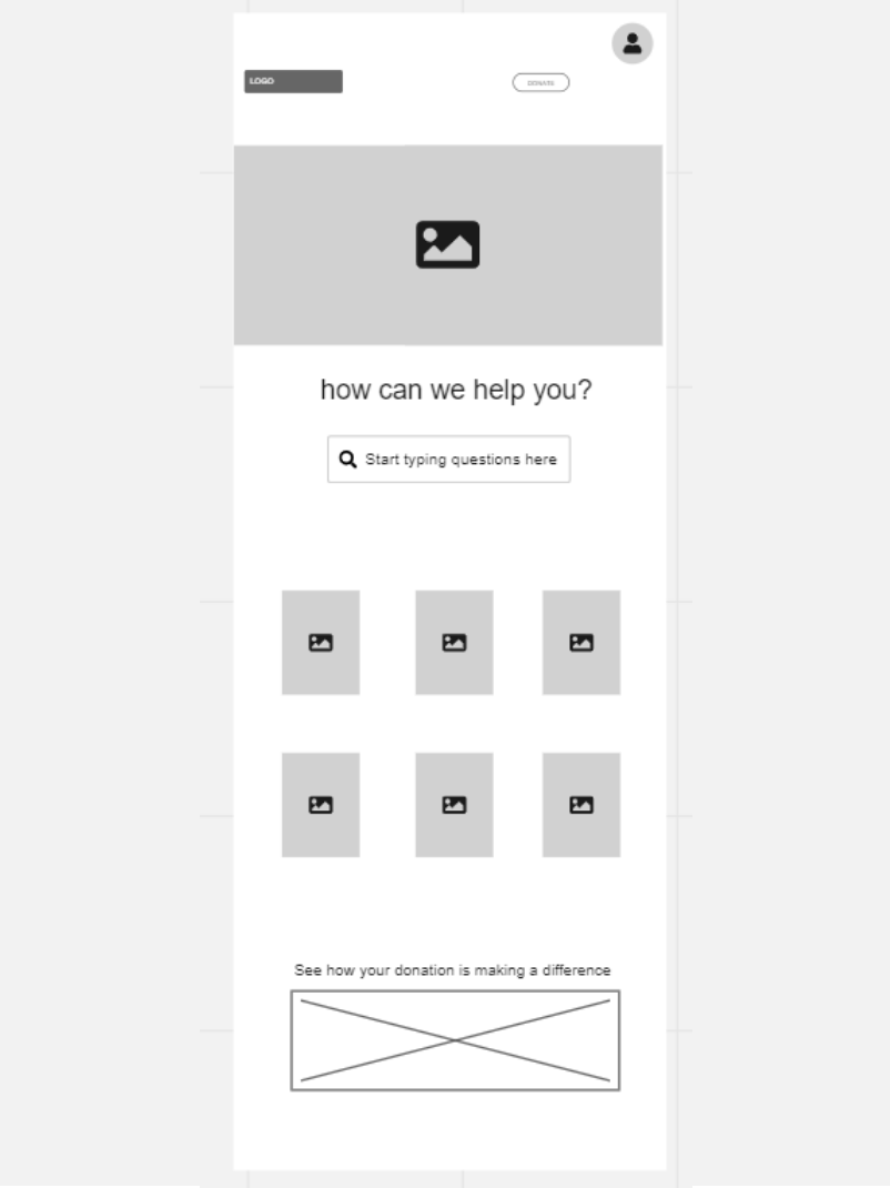
Wire frames
Wireframes are images that display the functional elements of a website or page. This helps plan the site’s structure and functionality. Oxfam’s main focus was redesigning the “contact us” page.
Testing
Usability Testing
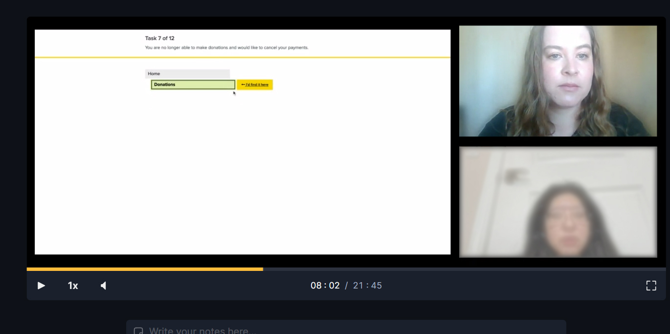
Treejack test
Tree jack or tree testing helps you evaluate the findability and hierarchy of content on the website.. This helps to build an intuitive digital experience that’s simple for users to navigate.
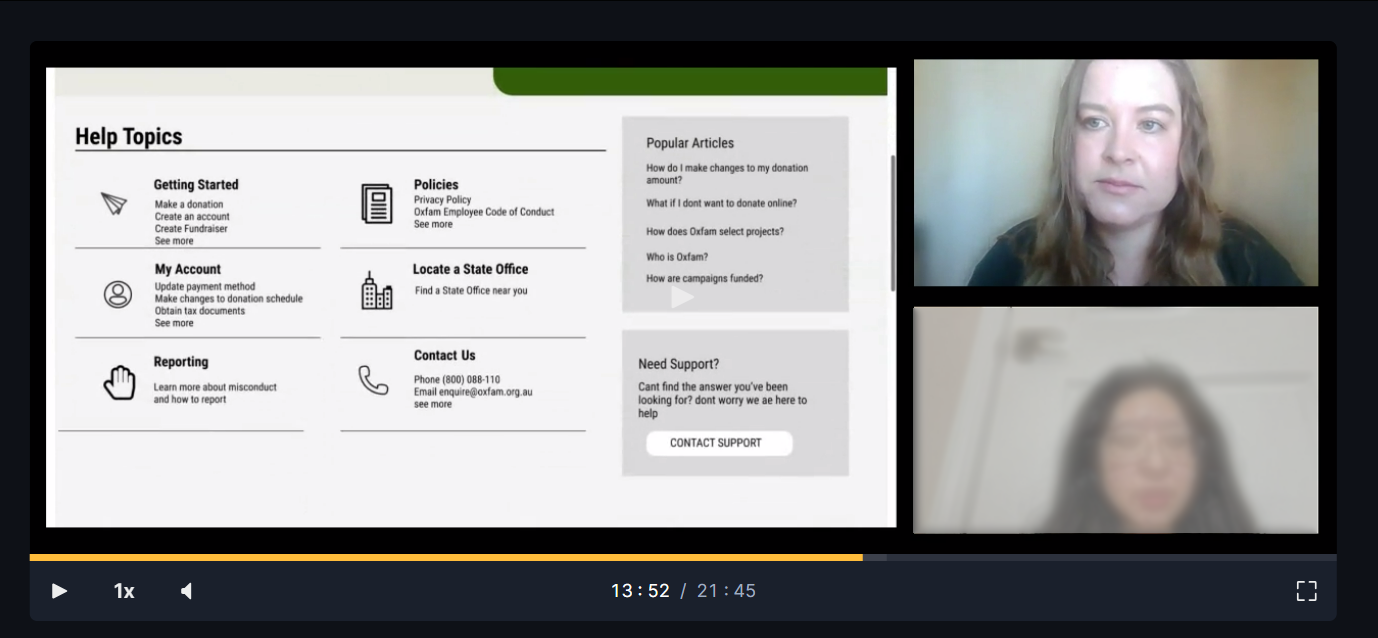
Chalkmark test
First-click testing measures the usability of your digital experience based on the actions users reach for first and helps build an intuitive user experience.
Success insights
- “Clean design”
- “Easy to read and to navigate”
- “Helpbar was easy to find and helpful to use”
Usability Issues
- “I would prefer larger and easy to read topic tiles”
- “I would like to be able to send a message right from the “contact us” page.”
- “ I do not want to have to use my own personal email on another page”
- Popular articles were not utilized when trying to find a specific topic.
Iterate & Refine
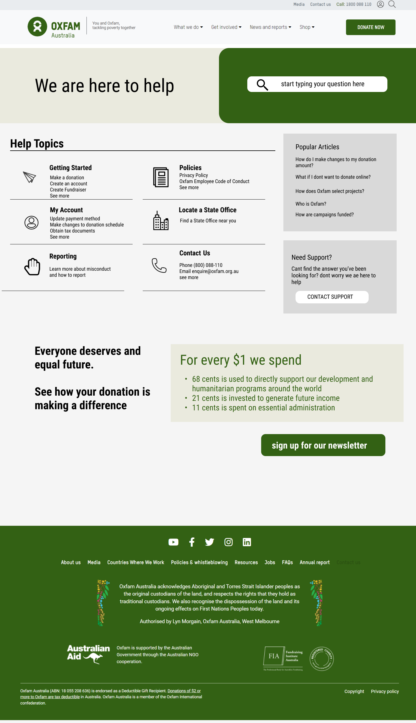
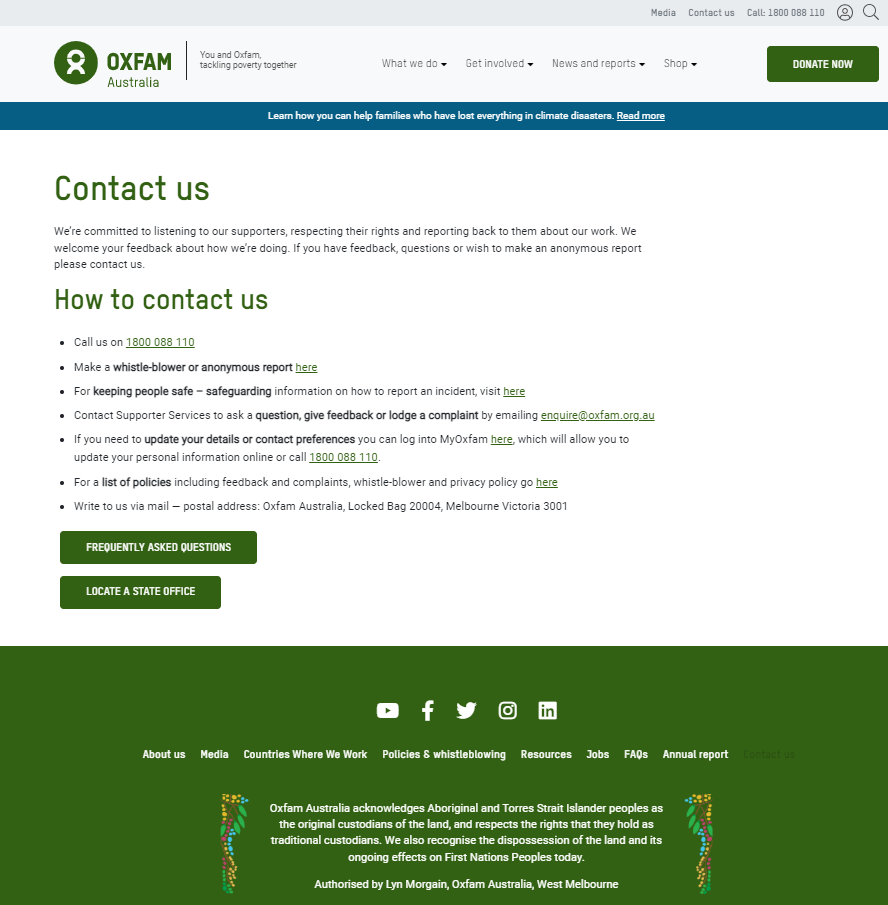
Original Contact Page
High-fidelity Wireframe
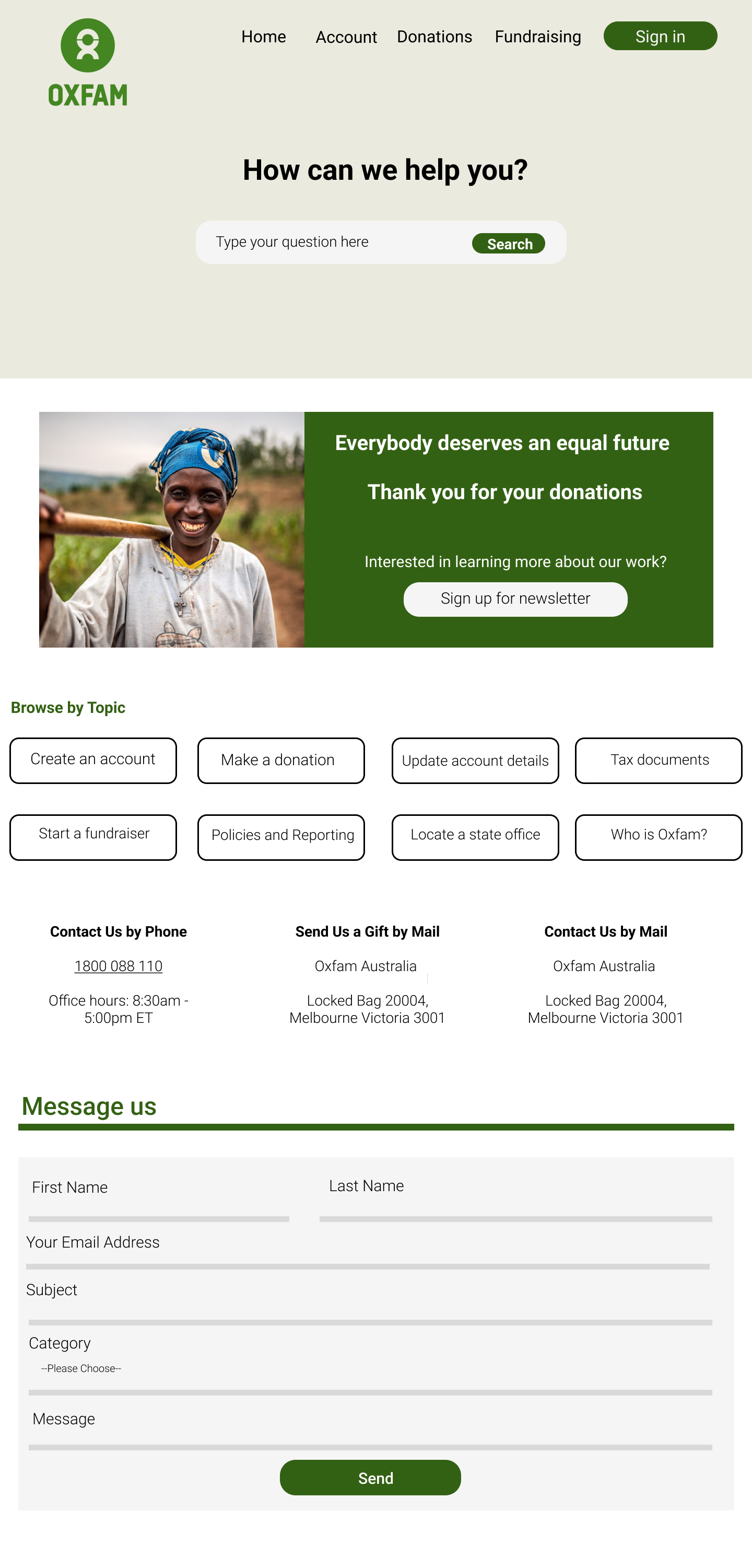
Easy to locate “Sign in” button
During testing I found there to be a high failure rate when users tired to locate how to sign in. Now, there is an easy to find sign in button so users can easily log into their account.
Welcoming tone
The client wanted their users to feel like they are walking into their office and are being greeting by staff. Now, that message is clear.
Convenient navigation of topic tiles
During testing users found it difficult to explore the page and wanted very clear language when trying to trouble shoot. Now, the most common questions are easy to navigate.
Message box on same page
During testing users wanted to leave a message right on the contact us page and did not want to navigate to another area to do so. Now, users can select the message category and leave any message they like.